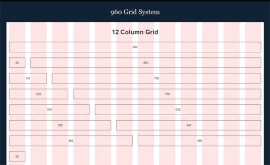
When you first begin a web design project where do you start? Color scheme? Fonts? Probably not. Most of us start with a sketch outline of the site's structure. A big part of this structure lies in the grid ‚ a vertical set of guidelines that help determine shape, placement of items and overall structure of each website. Grids are a tool for visual problem solving — they create layout boundaries: known relationships and constraints that define an environment wherein a design can occur. There are a variety of grid-based structures. Most commonly, a grid is made of multiple columns and gutters of equal widths. Grids can also be created from columns of varying widths to form bigger columns.
Column Grids

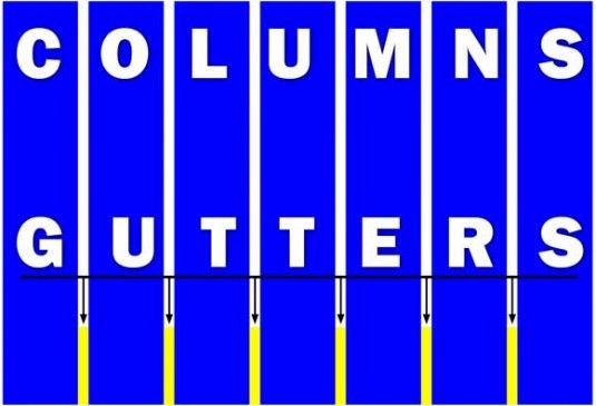
Every vertical grid is comprised of two things ‚ columns and gutters. Columns are the wider divisions, while gutters are defined as the equal spaces between columns. Even when a grid contains columns of varying widths the gutter widths are often static. Web grids vary widely and there is no magic number of columns or width of gutters. Often web grids range from 2 to 12 columns. When using a vertical column-based grid, the lines are typically invisible and only known to the designer or developer. However, these lines do create a plane for all the objects ‚ text, images and even ads ‚ so that everything lines up neatly. This will create organization and an overall sense of harmony between elements.
Building A Grid

The first step in creating a grid is to set your size constraints — how wide will your page be? When designing the grid, think about how elements will live within the columns. Are you planning to design strictly in column and rows or is your grid going to be used more in a way that looks "less gridded?" Then think about flexibility in design ‚ how many columns do you want to work with. Ideally, you will work in sets of threes or fours, so that you have divisible groups that can be broken into smaller parts. When considering the number of columns in your grid, also take gutter widths into account. Commonly, gutters are 10 to 20 pixels wide. Then it is time to do the math. Determine your overall site width. Set a gutter width. Determine the number of columns. Take your overall width minus the gutter widths (keep in mind that you have one less gutter than total number of columns). Divide the remaining number by the total number of columns to get a width for each column.
So lets say I choose to design a layout with a width of 1140 pixels, a gutter size of 20 px, and I want 4 columns. That will give me 3 gutters each at 20px.
3 x 20 = 60px 1140px (Total width) - 60px (Total gutter width) = 1080px. Then take that number and divide by the number of columns. 1080px / 4 Columns= 270px.
Finally you are left with the width of each column in your layout.
(Total width of grid) - (Total gutter width) = Total width of columns (Total width of columns) / (Number of columns) = Width of each column.
Implementation
Thankfully, there are some great tools to help you get started with designing with a grid. They provide photoshop templates, calculation tools and examples to help you get started. Your designs will be greatly improved by using a grid as your foundation.
960 Grid System
1140 Grid System
